
Icon management system
Solving the problem of icon management
Background
Asset management is always a tricky topic in most development (or design) projects. Also the ideal ways manage the resources changes with scale and asset types making it even more tough to create a singular solution.
Task
The task was to create a management system for icons which could scale to accommodate 200+ custom created icons for UNI, is scalable, fast and dumb-proof.
My role
This wasn't a task which was assigned to me but a problem which I saw in our internal process. So I took it as a challenge to solve. Since my teammates were essentially the users, I relied on their feedback and also took help of dev team in setting up Angular app on Firebase.
Process
Stage 1
Initially at UNI, each asset (icon) was created on demand and shared on slack channels for dev team. At initial stages when there were less icons to deal with and speed was crucial, it worked well for everyone. However, that would also mean lot of repeat work. Someone would design icon and share png for that and if you need icon in a different color or even different size, well, the entire process was repeated.
Upon joining the team, my first course of action was to replace png with svg to get rid of scaling issues (and coloring, but that didn't happen) however we soon hit a roadblock with that as well. The next issue was managing all those icons. We would generally create something on spot, export it and forget about it. But it was a pain to look for existing icons. In some cases, we would forget if that icon was previously made and remake it from scratch. Also, in case we wanted to replace a particular icon with an updated design, team would need to look up every instance and manually replace it which as you guessed, was a mess.
Stage 2
To solve that issue, we started storing all our assets on AWS S3 bucket and every time someone needed a particular icon, we would pull-up the link and shoot it on slack. Neat right? no!
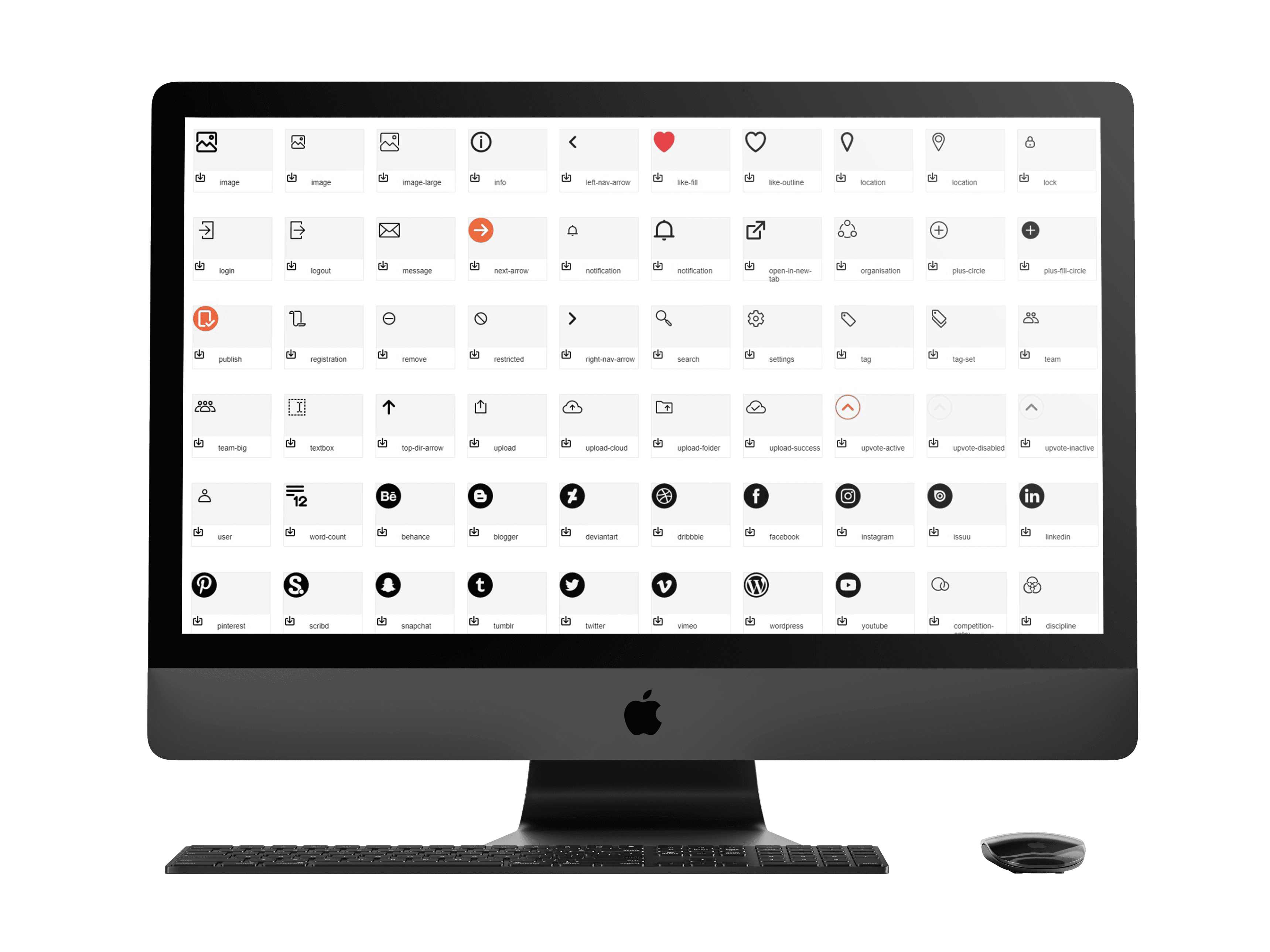
The first issue this time was with naming of icons. What is hamburger icon for me would be 3 bars for someone else and horizontal strips for third person in the team. Since, S3 doesn't provide any preview pane for elements, it would essentially mean multiple hit and trials till we reach the icon we needed. This became an issue so big that we essentially started bypassing this process and sharing icons on slack as before. So, in order to keep the system running, I wrote a web app in Angular (I learnt angular just for that and it was my first app ✨) which was essentially a visual catalogue of assets saved in S3. So instead of looking up in S3, we could directly find icon in the catalogue.
Outcome
Final design
This was something which everyone liked and we followed the system for quite long, but there were another set of issues in this method as well. This time, the color. SVG natively allows you to change the color through code. However, since we were storing the SVGs in a central repo (S3), in code it would be imported as an image losing the properties to change color. That meant for every icon we used, I needed to make multiple variants of it in different colors and the lazy me hated that. At that point, I was looking up for ways to address this issue and conducted a case study on ways in which material icons are used in projects. At that point we were also considering using a paid asset management tool but couldn't find any that would fit all out use case.
Ultimately, after a lot of research, I came across the concept of glyph-cons where you could essentially convert icons into glyphs and use it like we use alphabets. However creating an iconfont isn't a cake walk (it is, but not newbie friendly). I practically spend weeks to find tools to generate an iconfont and after much deliberation, landed on a way to do so. At that point I even wrote a blog to help non-techies like me to do what I did without having to go through things I had to. You can find it here: https://vaigu.medium.com/creating-an-iconfont-a-how-to-guide-dd7227d245a1
Challenges
The idea of using glyph icon-font came with its own set of issues. I am well aware of the accessibility issues and the alignment inconsistencies. However, weighing down all the pros and cons of all the options available, this seemed best for our team at current stage and we went ahead with that.
Final solution
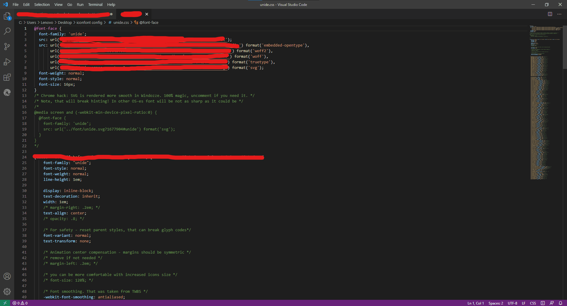
Currently, for icon library, we note convert the icon into font using fontello. Upon that, I manually clean up the file (code) and host it in form of stylesheets. The dev team imports that stylesheet and icons are called by their names.
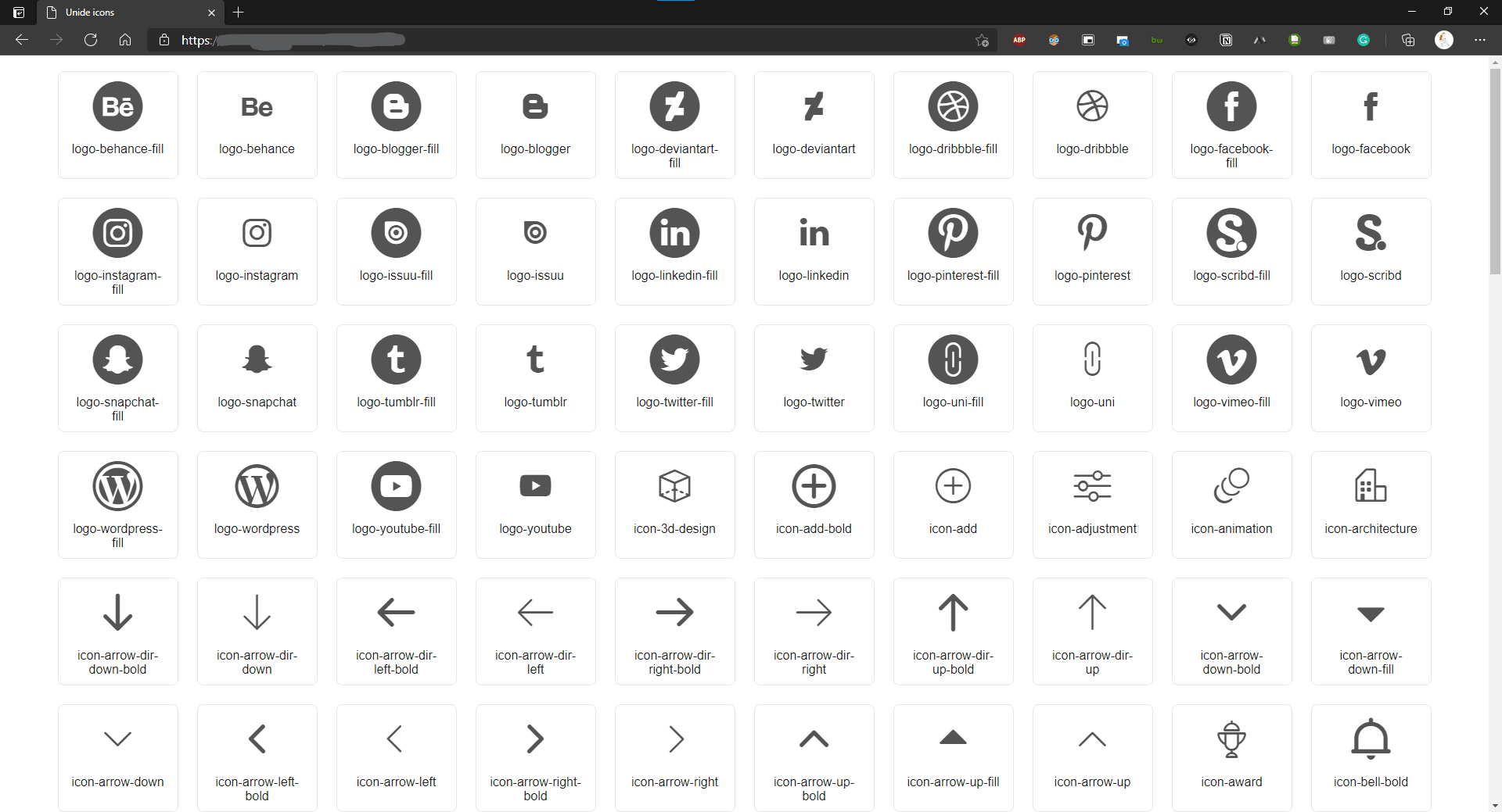
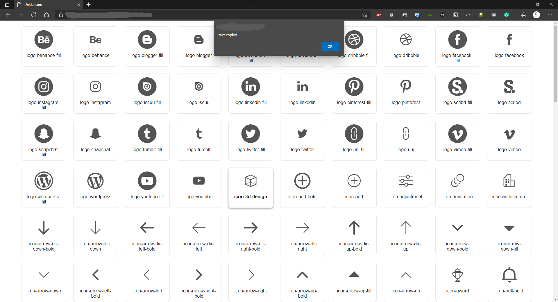
But since we're talking of code, the problem of naming confusion was still relevant. For that, I created a visual catalogue for the same. This meant devs now just need to copy paste the name and use it in their code.
However, life ain't that simple and single character issue while copying would lead to icon not appearing. So, I added a function where once a dev click on icon card, the name will get copied to clipboard. I know that's not a major functionality but I had to learn to do this and I'm proud of that.
Impact
I do not have a quantifiable metric to talk of impact of this implementation but after this system, it takes me 30 mins to add a bunch of new icons to library and basically forget about it. I haven't received a single complaint from the dev team so I can assume they're happy. The lazy me also saved lots of repeat efforts. Also, size & colors of the icons are problem of the past.
Learnings
This project was full on learning and at occasions pushed me to go beyond my capabilities to solve the problem. I learnt basics of Angular, built an app and found a solution to problem which actually made an impact on how we worked.